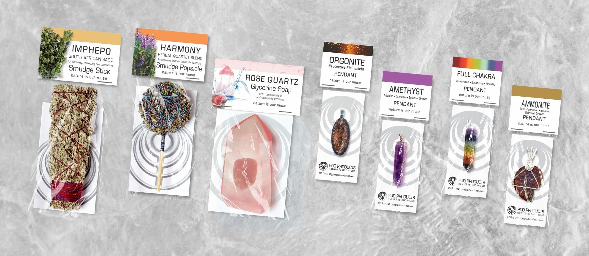
Brand Packaging for POD Products, South African small business specializing in hand made crystal pendants, herbal smudge and crystal soaps. Image shows some of the available products and how they are packaged.

POD Products Brand Packaging

POD Products is a long standing client. We go all the way back to 2008 when I first helped Philip with a logo design. He’s still using the same logo – we’ve just refined and simplified it over the years and. POD is a local (South African) company located in the KZN Midlands, hand crafting and selling holistic wellness products like crystal pendants, herbal smudge, dowsing rods, and gemstone soaps. Let’s talk about he process of POD Products Brand Packaging.

Philip first hired me to work on his product packaging in 2009 – for 4 wire-wrapped crystal pendants. That range has since grown to 12 items. He has since added a range of Smudge wands, sticks, and popsicles in 5 variants, a range of 21 piezoelectric crystal resin pendants, 4 piezoelectric crystal chakra pendants and pyramid, 6 orgonite pendants and shield devices, and 4 gemstone soaps.

POD primarily sells products wholesale to suppliers via Takealot, The Spa Room, Canna Kingdom, Top Rocks, Amazing Crystals, and others.

Miraculously, this small business has thrived despite having no social presence and minimal online presence, aside from that of direct suppliers. It makes me wonder how much better it could have performed with a proper online strategy.

Packaging Design

The styling of all header cards is identical, except for a strip at the top of the card, the colour of which is changed depending on the individual product item. This acts as a product differentiator, helping buyers to quickly find the product they’re looking for. All title fonts and text placement are identical through all of the headers. The smudge and products are differentiated by a colour band but also by an image of the product herbs on the left side of the header. The same applies to the crystal soaps which have an image of the main ingredient on the left (rose, lavender, etc).

This consistency through all packaging makes it easy for buyers to pick out POD’s products on a shelf of other brands, and helps with brand retention and buyer trust, and encouraging repeat customers year on year. Keeping the header designs clean and the text on a plain white background, makes it quick and easy to see which product is which over busier more disorganised competitor products.

Packaging design for all the POD Products items is simple and functional, consisting mainly of folded header cards that are stapled to the top of each product packet. On the front of each header card is the product name and a short description. On the back of the header is a bit more about the product and its uses. Inside each product packet is either a card (crystal products) or a folded info pamphlet with more info, directions for use, and contact info for POD.

Images above and below show packaging examples for: chakra resin crystal pendant range, piezoelectric resin crystal pendant range, Orgonite pendant range, smudge stick packaging, smudge popsicle packaging, soap packaging. Packaging was designed for 61 products in total.

Over the years there has been a definite evolution of POD’s packaging. Initially, a script font was used for the product title (on insistence of the client, lol). But we have recently taken the packaging to another level by simply replacing the decorative fonts with a plain serif typeface. The POD logo has also evolved from the ‘3D’ version (seen in the header at the top of this page – smudge products), to a simple flat version of the logo.

Along with designing all the header cards for this brand, individual mockups were created of every single product item for the client to use through their catalogue and media kit for sellers. These were created using photographs the client took himself and sent to me, combined with the packaging designs I had created – to build a high quality composite mockup of each product (seen in the header of this post).

POD is another great example of growth and evolution of a small business through consistent branding, and adjusting of their brand aesthetic and packaging needs to market demands and expectations.

In the year ahead, 2026, I’m hoping to continue working with POD on growing the business further through launching a social media and consulting on rollout of their own online shop.

Until then, you can see a few of POD’s products on Takealot.

0
    0
    Your Cart
    Your cart is emptyReturn to Shop