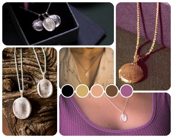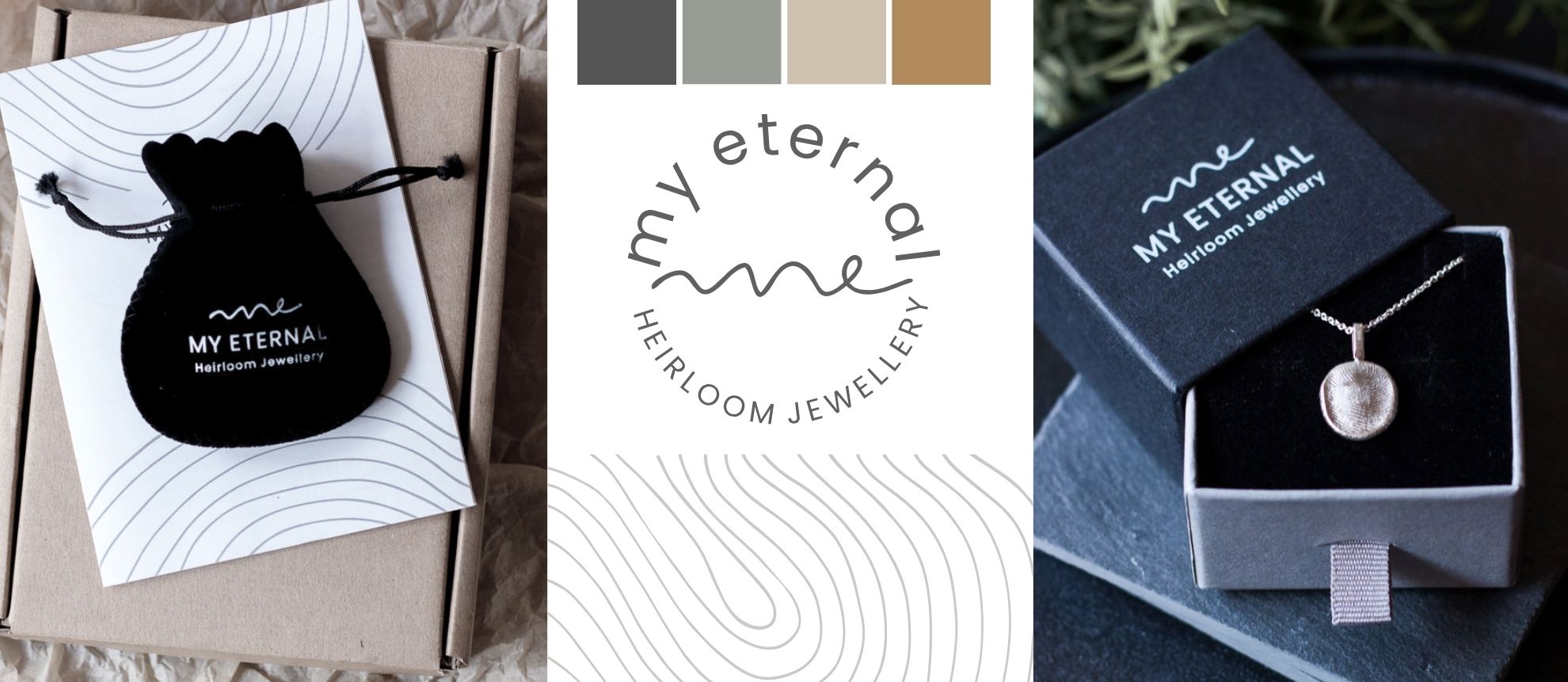
My Eternal Heirloom Jewellery Logo Development - image shows some of the components built in creating the branding for this small business.

My Eternal Logo Development

The My Eternal Logo Development project kicked off when Jackie Rens reached out to me in 2021 to design a logo for her new company. I had worked with Jackie before on other projects before she branched out on her own to launch My Eternal, which evolved from a hobby. Jackie creates beautiful, timeless, silver and gold cast heirloom jewellery pieces from individual one-of-a-kind wax imprints created by her clients, such as fingerprints, paw prints, lucky coins or sentimental keepsakes. They are great gifts for someone special.

Clients are sent an imprint wax pack containing a piece of wax to press their fingerprint or any object into, along with detailed instructions. Wax is used because it allows the user to rehape it and redo their print until they are 100% happy with the end result. The wax imprint is carefully packaged into a supplied box, and sent back to My Eternal who then transform it into a sterling silver or gold pendant, cufflink, or other jewellery piece. It is then sent back to the client, beautifully packaged, of course.

When Jackie first made contact with me to design her logo, she sent me some of her own drawings, and a description of what she was looking for: “a very clean, contemporary, minimalist look. Preferably a unisex appeal – not too feminine as I’d also like to appeal to men to buy for their wives (and vice versa).” My process in 2021 was different from how it works now – it was looser and not as strategic as how I currently work. My first ideas were extremely minimalist and not organic enough to represent the product well but after a few scribble sessions, I did end up with a great concept that really works well for this brand, and that the client loved!

Project Scope: Creating an Heirloom Aesthetic

The target audience for this product is mostly upper-middle to higher income, including those of generational wealth who value heirloom items and the passing down of personalised items through each generation. Clients are sentimental and value family and community. They will place trust in a company that looks high end and produces a quality end product, that is transparent and professional.

After my usual conceptualisation and brainstorming process, I came up with the wavy handwritten ‘me’ signature mark for My Eternal. It was drawn on my iPad using Procreate, and transferred over to Corel Draw for adjustments and vectorising. The signature style reflects the individuality of the product (personally imprinted pendants). It is also representative of a chain with the ‘e’ loop being the pendant. I’ve used a simple open sans serif font to balance the informal hand-drawn signature. ME is also a nod to the personalisation of the product and something that clients can regard as ‘valuable to me’. So it acts as a psychological trigger to do something for oneself, or share a part of oneself in the form of a fingerprint, ‘this is me’.

We created three versions of the logo: the primary logo, a circular badge-styled logo, and a simple word mark that excluded the ‘me’ signature. Along with the logo I also drew a simple fingerprint element that we’ve used through the packaging and brand visuals for My Eternal.

The 3 images above show how the primary logo works overlaid onto a product image, the logo mark, primary logo and circular logo (centre), the circular logo overlaid onto a product image.

Outcomes and Updated Palette

Jackie reached out again in 2024 requesting updates to the palette. This is completely normal for a new business and clients often request some adjustments to brand visuals after working with their logo and elements for a couple of years.

The initial palette was quite neutral with a boho slant (green, wheat, brown, black). Jackie wanted to brighten it up a little to differentiate it better so so we removed the olive green and replaced it with purple, we also added in a shade of apricot to uplift and balance the darker tones and work alongside the slightly darker wheat/gold shade.

I’ve also designed packaging for this brand which will be shared in a different post and linked here when published.

The 3 images above show the original palette, the My Eternal website built with the original palette (centre), and the updated palette on the right.

Take a look at the My Eternal website if you’re interested in their unique product.

0
    0
    Your Cart
    Your cart is emptyReturn to Shop