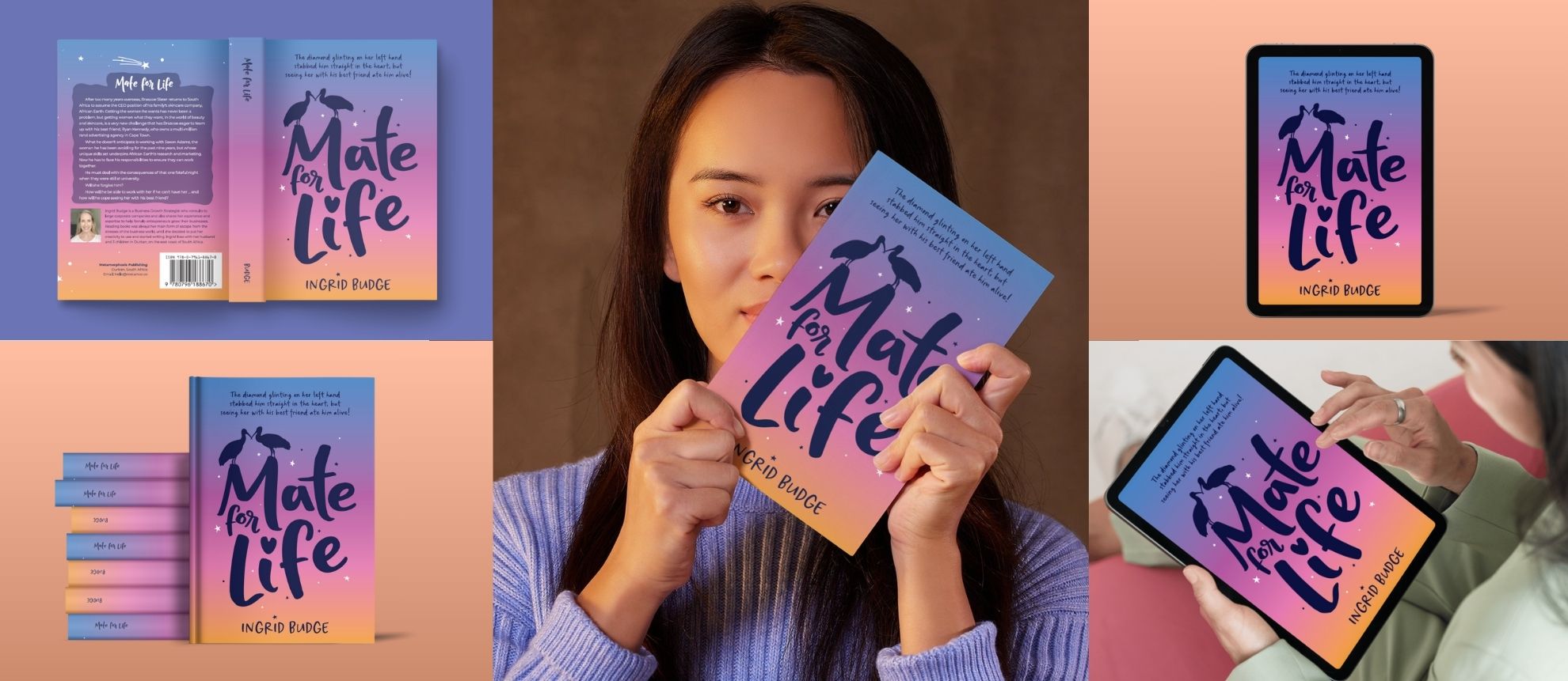
I’m not sure if I should be sharing this yet because I don’t think the author has actually published this work (I can’t find it online), but I’m going to share it anyway because it was such a great project.
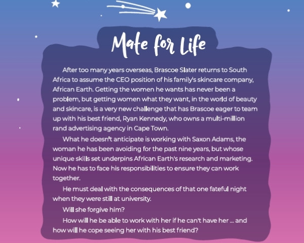
Ingrid reached out in Feb 2024 for help with publishing her first book, ‘Mate for Life’ a ‘light-hearted trashy’ novel (her words), set mainly in Durban and Phinda Game Reserve. She wanted to write a story that speaks to the beauty of South Africa and highlights KZN, for a change from the usual politically-inspired local novels.
Scope of work and Process
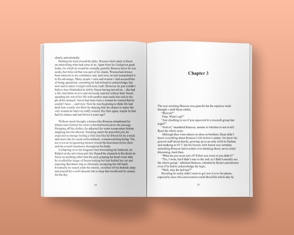
Items ordered for this project were: cover design, typesetting for print, and configuration for epub.
As is often the case, Ingrid sent over the draft manuscript for me to read first before we started with the cover design while her editor worked on finalising the manuscript. Ingrid wanted to work with a hadeda (local Ibis bird) theme because they mate for life and are a local South African species. The main characters in the story start off as good friends and and up as a couple. She wanted a simple but bold style. Right up my creative alley!
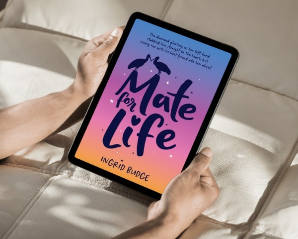
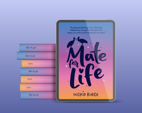
I have an entire family of hadedas living in my garden so am well versed in their habits. For this cover design I took my own photos for reference then traced and tweaked them to use in the design. If you’re not familiar with these birds, they have a very loud characteristic squawk, mostly heard at sunrise and sunset (and sometimes at 3am when they fall out of a tree). The colours used on the cover are sunrise/sunset colours for this reason. They also ‘flirt’ with each other by clacking their beaks together, and making a weird clicking sound at the same time. I’ve drawn the in this act for this exact reason.
The title font ‘Mate for Life’, was customised from an existing informal typeface, the letters adjusted to create the word mark used, with the hadedas incorporated perched on the M peaks, resembling rooftops – their favourite spot to hang out. Some simple stars were added around the word mark for interest with the sub title placed right at the top of the design and the author’s name balancing it at the bottom. The title typeface is quirky and informal, which is the message Ingrid wanted to convey for her novel. Her ISBN barcode was created and added and the cover design was good to go.