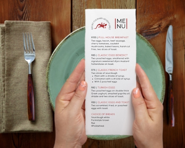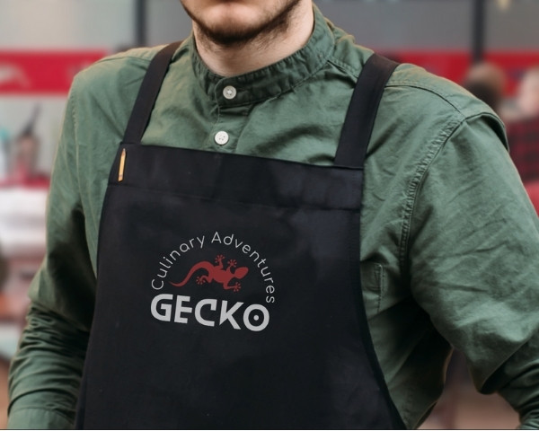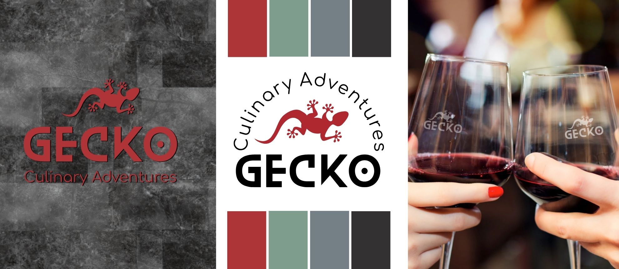
Banner image for an article on the Logo Design for Gecko Culinary Adventures showing the diner signage, new logo, and branded glassware.

Logo Redesign for Gecko Culinary Adventures

Before the Logo Redesign for Gecko Culinary Adventures happened, I had already been working with Megan Harker since 2011, on some small projects like Facebook graphics and then some business cards, an email signature and template, and a few other little items.

Gecko Culinary Adventures is situated on the Berea, in Durban, and offers cooking events and classes as well as a dining experience.

I’m just gonna say it. I’ve always had a problem with the original Gecko Culinary logo and have been angling to change it for years. For starters, it was blue, which is not a great colour for a food-related business. Secondly, the style of the gecko icon in the logo was, hmmm … odd, with little stick-insect legs. Also, not a great match for her professional and robust brand message.

In 2019, I eventually succeeded in convincing Megan to change the colour of her logo and branding, and she settled on a red and gold palette, which wasn’t perfect but better. She was still VERY attached to the logo graphic.

But it wasn’t until 2023, when Gecko was undergoing some major revamps, that Megan reached out for a redesign. To say I was excited was an understatement. lol. And I was also very grateful that she wanted to work with me on it.

Megan is the sort of client who loves to be involved in the process of whatever I’m working on for her, so she sent me some font examples, the initial one being quite a loose script, which I wasn’t mad about. I had taken aside a couple of fonts to work with, but wanted to customise them when Megan sent over the Blanka font and told me, ‘This was the one’. It did work with what we were building, so I was happy to use it.

Colour-wise, we were going to stick with the red as a primary, but darken it a little, and add black for solidity. We chucked out the gold and replaced it with a lovely sage green for differentiation. It’s also a feature colour in her decor, and we added a chocolate brown as a backup option.

Images below show the original logo, the restaurant reception, and the final new design.
But it wasn’t a straight line to get there. Let me tell you about the process.
Developing the logo

So, I started with some iconography that didn’t include a gecko. I know, I was pushing my luck. lol. The first version was a very minimalist and geometric, abstract gecko foot icon with the little round sticky toes.

The second proposed design was a word mark in the original rough handwritten typeface that Megan had originally liked (this was before we decided on the final font).

I also presented a third concept with a bowl of mountains with a little red flag. It was cute, but in retrospect, there wasn’t enough association with the ‘Gecko’ word.

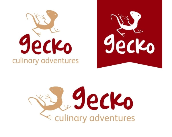
Megan admitted that she really was still very attached to the gecko icon, so I offered the option to redraw it, but in a style that was more in alignment with her professional image. So that’s what we did. I had some photos of actual geckos on my phone that I had taken myself (we had resident ones that have managed to elude all the cats), so I used those as the base for the drawing, adjusting the leg positions to fit the design.

Why did I have random photos of geckos on my phone? I was planning on printing them, cutting them out, and sticking them on the walls around our house for our 7 cats to ‘catch’ to deter them from trying to catch the actual gecos – if you must know.

The final graphic was a much more solid and stable-looking gecko, but still with some character in the exaggerated toes and quirky positioning of the legs.

Megan’s words in an email she sent me after presenting the final design:

“I am totally in love with my new logo!!!”

Say no more.

Final files and wrap up

We had to fiddle with the shade of red a bit because the red that Megan was seeing on her screen looked muddy compared to my screen, where it looked fine. To solve that issue, I sent Megan a PDF swatch of different red versions to take to her printer so she could see how some options really looked, and choose the one she liked best.

Once everything was approved, I sent over the basic logo files for Megan to get started with.

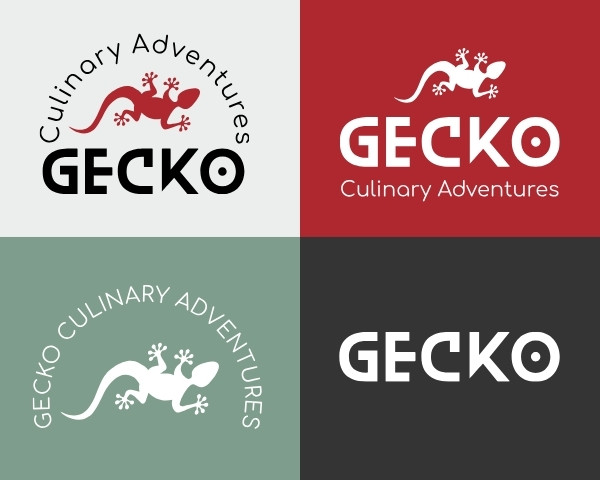
A few months later, she needed all the files so I built out a full set of logo versions for her to use. These included the primary design, secondary design, an alternate version, and a wordmark. This enabled her to have all the versions she needed to use through all her brand assets, like stationery items, online assets, and printables like signage and posters.

If you want to learn more about Gecko Culinary or book a class with Megan, hop over to her website here.

0
    0
    Your Cart
    Your cart is emptyReturn to Shop